MICHAEL ST.MARK vs WOLFF OLINS
Claim. Copyright infringement of the original artwork Infinitude II, by Wolff Olins branding consultancy through their 2012 London Olympic brand logo.
Fair use comparison content.

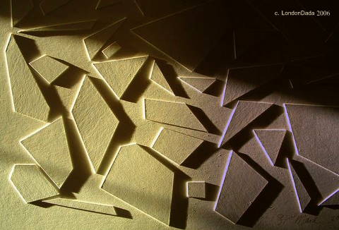
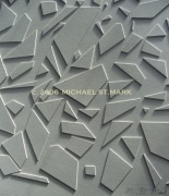
Sunrise over Infinitude II ( Acrylic-painted wood bas-relief on board, 60cms X 80cms ) c. Michael St.Mark 2006.
Infinitude II – a blank canvas.
The relief artwork Infinitude II was purposely rendered in white by the artist in order to have the ability to faithfully reflect an infinite range of colours and its jagged flat shapes (polygons) are slightly raised in order to cast shadows or to expose highlights; all according to variation in its ambient lighting, therefore potentially having a different look or version from one day to the next.
This completely novel flexible colour / border edition functionality was clearly documented by the artist alongside images of the work at the time of its release ( Jan 2006).
Extensive research indicates no published work exists within fine art or graphic design history prior to release of Infinitude II, that incorporates such flexible colour and border-switching multi-edition function.*
.


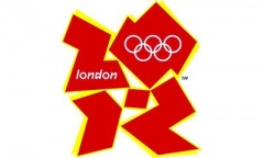
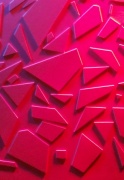
Two cropped areas of Infinitude II ( Jan 2006. Acrylic, white-on-white), in differently-angled natural light, its flat jagged polygonal shapes casting black shadows… to either side of the controversial London Olympic brand ( by Wolff Olins, cost £400,000 ) primary version identically white on white, its unmistakably similar jagged flat polygonal shapes ( claimed to represent the date 2012) bordered by black shadows and therefore obviously designed to represent a (3D) bas(shallow) relief form.
“… it ( the Olympic brand logo ) is a blank canvas.. ” – Patrick Cox, head of the Wolff Olins design team.
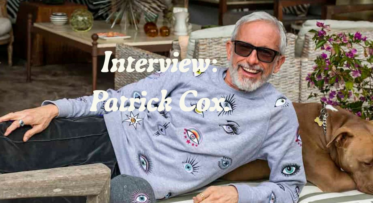 Patrick Cox today – shamelessly basking in his Baleric 2012 Olympic Logo IP theft payoff surroundings.
” They ( Cox’s 2012 Olympic Logo design team @ Wolf Ollins ) are even more unscrupulous scoundrels than I thought ” – Stephen Bayley, the ” Design Guru ”
https://en.wikipedia.org/wiki/Stephen_Bayley
With its four similarly jagged flat shapes immediately surrounding an almost identical small central quadrilateral ( which, contrary to Wolff Olins’ claim plays no part whatsoever in representing a date of 2012 ), solid in appearance and identically rendered white-on-white in shallow raised relief bordered by shadows -and in some colour editions identically by highlights- the London Olympic brand logo closely imitates, in these and other basic key aspects of its design, appearance and function, both the general whole and a substantial specific part of the pre-dated, pre-published Infinitude II with such unmistakable cumulative similarity as to warrant initiation of legal proceedings against its creators Wolff Olins brand consultancy on grounds of copyright infringement of an original work.
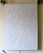
Larger cropped segment from Infinitude II illustrating its jagged shapes’ variable shadow-through-highlight borders and the colour-change function absolutely integral to the work, as stated by the artist on its release in January 2006 ( pre-dating Wolff Olins Olympic brand release by over a year ).
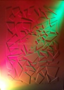

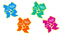
Above; Infinitude II in natural daylight followed by two examples of the artwork’s broad visual flexibility, being lit by adjustable ball & socket primary colour spotlights as per the original design brief; allowing for a new differently coloured/ bordered version whenever desired …. followed by four ( from among many ) colour versions of the 2012 Olympic logo, its jagged shapes bordered by highlights instead of the previous shadows.
The unmistakably similar jagged flat polygon shapes raised in shallow relief of the pre-existing published artwork Infinitude II; identically to those represented in the Wolff Olins brand logo that shortly followed, have changeable shadowed, outlined or highlighted borders and overall the work has identical multi-colour edition capability, function and purpose.
Thus the logo’s use fundamentally duplicates the objective of the original ( Infinitude II ) and furthermore cannot be claimed to be visually transformative.
* Extensive research indicates Wolff Olins’ 2012 Olympic logo to be the first in 150 plus years of corporate branding history to have many ( including those assigned to Olympic “partners” ) colour /shadow-highlight editions and which just so happens to have been – rather incredibly- designed during the months immediately following the unmistakably similar-looking and identically-functioning Infinitude II was registered and published openly on the worldwide web with eminently accessible art & design tags and search links. ( Eg. LD Infinitude II archive stat’s for month of June 2006 – 2932 page views ).
Additionally, no previous logo can be traced from among many thousands over almost 200 years that uses flat jagged polygons outwith any known type face in order to represent itself in numerals or letters that deliberately manifest border shadow / highlight switching through multiple colour editions.
* * * * * * * * * * * * * * * * * * * * * * * * * * * * * * * * * * *
Quotes
# “The jagged emblem, based on the date 2012, comes in a series of shades of pink, blue, green and orange and will evolve in the run-up to the Games. – Michael Wolff, partner Wolff Olins
# “This (logo) is the vision at the very heart of our brand,” – London 2012 organising committee chairman Lord Coe who, along with the committee, selected Wolff Olins brand consultancy as the preferred bidder without requesting viewing of any preliminary sketches, studies or early outlines of the logo’s proposed form.
# “Our new view of branding, claimed Brian Boylan ( chairman Wolff Olins) speaking in 2007, “is that the brand is no longer a single neat and tidy logo that you stick in the same place every time. Our thinking of brand has moved on. The brand is the platform, the brand is flexible, the brand is a place of exchange, and it is not fixed, so there is not one logo. There is recognizable form and recognizable communication and behavior, but it’s not one type of constrained and fixed thing”
# ” Mr Boylan means the shape of the brand logo remains constant but its color changes and its borders change between shadows and highlights in its many different versions. That’s what he means”.
– Michael St.Mark
LINKS
2006 web post featuring Infinitude II along with the artist’s intent statement on the work.
http://londondada.blog.co.uk/2006/01/20/work~488776/
New Dada Flikr gallery P.3 featuring the work;
http://www.flickr.com/photos/newdada/page3/
Some further relevant links and extra images.
http://news.bbc.co.uk/sport1/hi/other_sports/olympics_2012/6718243.stm
http://www.davidairey.com/london-2012-olympic-logo-disaster/


Lord Coe – ” values creativity”.


Section from artwork INFINITUDE II, alongside the 2012 Olympic logo transposed in 3D onto the torch.
(click to enlarge the compare)… along with image of the Olympic clock in Trafalgar Square that also features the logo in shallow relief as originally intended.
The unveiling in Autumn 2011 of the Olympic torch for the games revealed the Wolff Olins’ brand logo cast into 3D – confirming it was designed to appear in bas (shallow) relief and to cast shadows or highlights – identically to Infinitude II . Here we see the two together, with Infinitude II lit by gold light from top left – a similar primary light source direction as that onto the torch logo in this particular image.
If it looks like a duck, quacks like a duck and swims like a duck, it probably is a duck.
+ + + + + + + + + +
Some further background history

Wolff Olins Olympic 2012 brand designers Patrick Cox and Brian Boylan with Olympic committee chief Chris Townsend.
( Photo courtesy of Daily Telegraph )
The Sunday Telegraph learned that the logo was developed in conditions of such secrecy that most of Wolff Olins’s 180 London staff knew little or nothing about it, with the few given security clearance referring to the project only by a codename. Wolff Olins representatives are still forbidden from discussing the project
Patrick Cox was in charge of the design team, and was assisted by Sarah Stevens, project manager and included Michael Wallace, a senior designer. In overall control of the “brand project” was Brian Boylan, 61, the chairman of Wolff Olins who has worked at the company since the late Sixties.
In that time, Wolff Olins built impressive links with the Labour establishment. Sarah Brown, the wife of Gordon, the prime minister in waiting, started her career at Wolff Olins after leaving university.
Michael Wolff, the company’s co-founder, was credited with creating Labour’s red rose symbol in 1986, and in 1998 its representatives were called upon by Tony Blair to be part of a group of “creative thinkers” helping to “rebrand Britain” and create the brief, heady days of “Cool Britannia”.
Mr Boylan is also a member of the Tate Modern Council and serves on the board of the Government-funded Commission for Architecture and the Built Environment. Mr Cox is understood to live in a £1 million gated townhouse near Primrose Hill, north London. His neighbors include writers Alan Bennett and Jonathan Miller.
David Miliband, the then Environment Secretary, Peter Mandelson, the British Commissioner for EU trade, live nearby.”
* * * * * * * * * * * * * * * * * * * * * * * * * * * * * * * * * * * * * * * * * * * *
# “Let’s be clear: we won’t change the design at all. We are proud of it. It will go down in history. We have created something original in a world where it is increasingly difficult to make something different.” – Brian Boylan, chairman Wolff Olins.
# ” Let’s be more clear; Wolff Olins’ 2012 Olympic brand logo is a long way from being original or different. From all available evidence and in the public mind it is easily shown to be substantially and unmistakably similar to the pre-existing original work Infinitude II in design, appearance and function and we suggest that is what is more likely to go down in history.”
– Michael St.Mark, artist.
* Design guru Stephen Bayley condemned the Wolff Olins logo as a “puerile mess, an artistic flop and a commercial scandal” – Daily Telegraph
http://www.guardian.co.uk/uk/2007/jun/10/olympics2012.design
* * * * * * * * * * * * * * * * * * * * * * * * *
Michael St.Mark media contact for info’, features etc,
St.Mark@londondada.com
Art Axis on Twitter;
http://twitter.com/#!/ArtAxis
Michael St.Mark on Flikr Pro, featuring London Dada year-by-year Archve, Photostream and new 6191 Collective Gallery.

Pingback: Work No. 35: Infinitude 1 ( and Rachel Whiteread ) | LONDON DADA
Pingback: London Dada work 522/523; Royal Bank of Formica Topboard / Pizza Flyer mid-removal; by Dingo | LONDON DADA
Who is the actual artist of the London 2012 logo? I myself am curious to know what was the inspiration for such a hideous design.
It does appear to be as you claim, to be copied from your work using the same style.
However, I believe there is more to these logos that everyone is missing.
Think about the characters and typography, Actually too many characters plus the fact that it resembles puzzle pieces. Almost like a Japanese Tangram.
As a design representing the Olympics, I didn’t get it. Visually it didn’t work for me and obviously many others. It did not scream Olympics and was most peculiar.
I personally have deconstructed this logo as well as the Paralympics logo.
What I have found most will say is a Bizarre coincidence or I am seeing things I want to see. You be the judge. As for me I am sure there is something buried in this logo.
Now that I find out this was accepted just on a bid submission without any drafts for consideration, really has me scratching my head.
If you are curious to see what I have documented contact me info@starlitestudio.com I will send the pdf file.
I don’t know if this would help your case. I just thought I would share it to see if you would find it believable or interesting enough to use in addition to your claim. I would be curious as how they would account for their logos possibly being a puzzle that symbolizes one of the biggest tragedies in recent history.
Based on what I see it is difficult for me to disregard my findings as coincidence. No doubt, you understand. Good Luck with your case! Please update. Case is still ongoing? Accountability!!!
LikeLike
Yes it is a “bizarre co-incidence” isnt it… and in 5 totally seperate and unique ways at once.
If you suggest that’s a BIG co-incidence, fine BB.
But high damages awards copyright claims have been upheld on less…
LikeLike
Like Eggbod I hate Lord Coe, I think he’s an arsehole, as an athletics fan I always preferred Steve Ovett, on your question, I think you might have a case if it weren’t against one of the most corrupt organisations in the world, dictionary.com says “the unauthorized use or close imitation of the language and thoughts of another author and the representation of them as one’s own original work”, open and shut for me, go for them but you’ll need a lot of money.
LikeLike
Thank you Mr.B, for your pertinent comment.
Money not too big an is(sue), thankfully 😉
BTW Can you put me intouch with Phil Simmons? Any idea his whereabouts/cyber whereabouts? ( PM please)
LikeLike
Looks like a pretty clear case of ripoffery to me.
Yowwww!
CATHEAD
LikeLike
Link for Lord Coe to look in.
LikeLike
Jesus Christ almightly, not only is the Wolff Olins logo absolute crap for an Olympics, but it very much looks like they nicked the concept and design into the bargain. I bet there wasn’t even a tendering-out process for it.
Jobs for the boys as ever, I wonder if Lord Coe knows about this.
Mike, there’s more original talent in your little finger…
LikeLike
Feedback, suggestions and contributions towards intellectual property litigation costs in London Dada vs. Wolff Olins.
Contact via Private Messages, link on our homepage.
* If registered, please Tweet this post ( icon above) to support our cause.
Thanks vm
M St.M
LikeLike