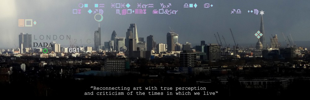
Primary Contrary The Conning of the Consumer / The Treachery of Words
c. Michael St.Mark 2011 ( title after Magritte’s The Treachery of Images )
Taking the generally accepted artists’ primary colours of red, yellow and blue, this seminal work intends basic dichotomy in visual/literal contradiction and confusion in the viewer, regressing him/her back to first intellectual learning, disassembling the mental link between experience and language that is used to such effect in politics, the advertising media and retail sector to manipulate the mass individual’s choice.. and so thereby awakening a powerful awareness of its powerful hold over us and the first step in weakening that iron grip.
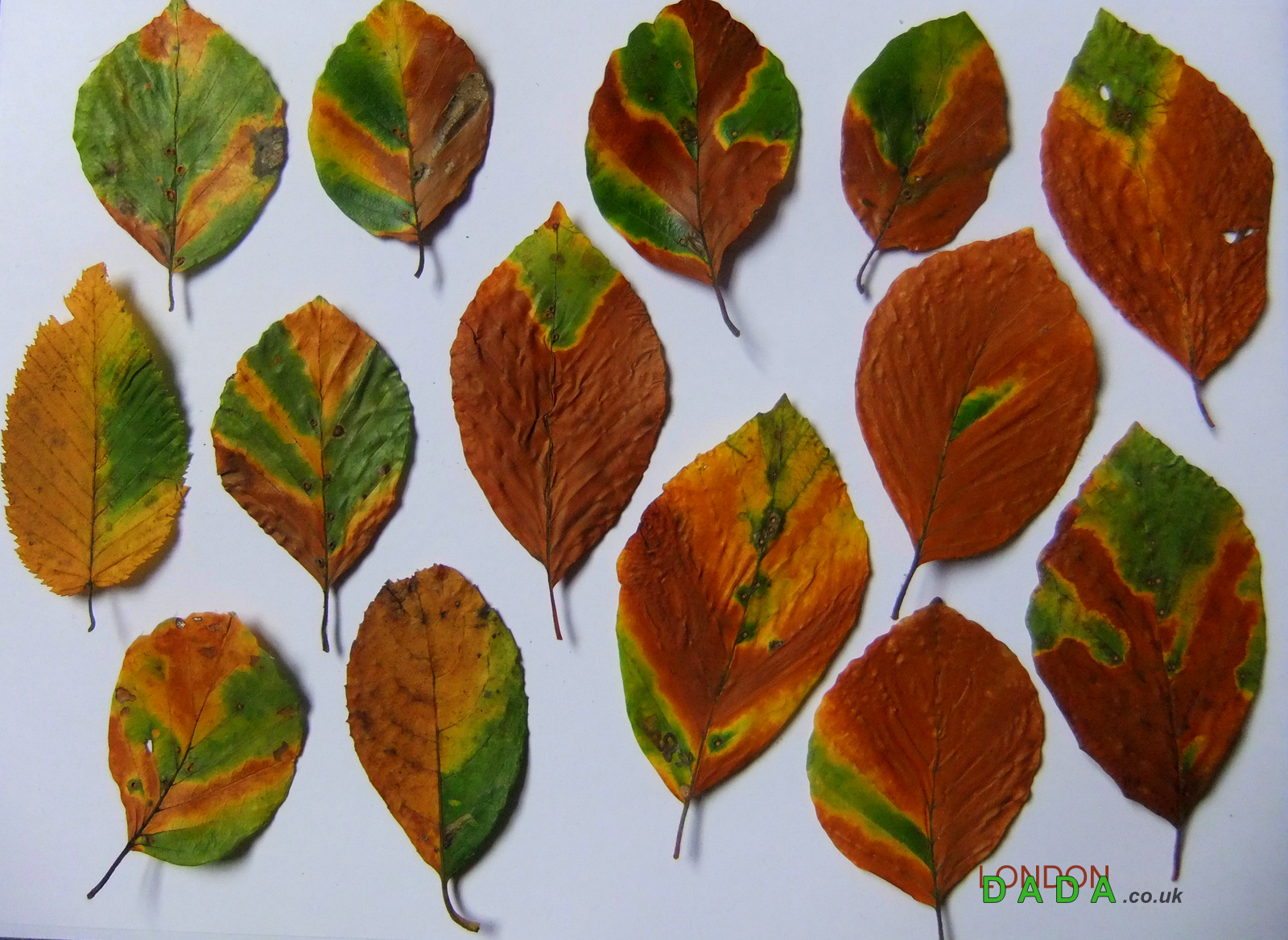
This Work is also specifically relevant to product labelling – horse meat in the packaging guise of beef, for example..
.. or “ Green Leaf Salad “
_____________________________________________________________________
UPDATE Oct 1st 2018
An interesting new consumer brain scrambler and ad’ man’s new impact text tool – coming to a billboard near you soon..
1ne, 2wo, 3hree, 4our, 5ive, 6ix, 7even, 8ight, 9ine 10en 11leven, 12welve, 13hirteen .. etc
® Michael St.Mark
_____________________________________________________________________
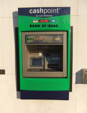
*Update; what’s new in 2020..
An online price compare company called 5ECONDS
” Search for anything at a better price in 5 seconds “
________________________________________________________________________
*Update; September 2024

Links to the London Dada Flikr archives