Unknown's avatar

About Michael St.Mark

Conceptual / experimental multi-discipline artist, writer and photographer. Art influencer and founder of London Dada, recalling Dada's original aims and principles as envisaged by it's founder Hugo Ball. Eschews the often politically-motivated taboo on expressions of critical thought within art. Admiring Duchamp in going beyond the seemingly endless infatuation with the ' pretty picture' retinal and instead refusing to accept the standards and practices of an established corrupt art world and creatively stifling conventions that are still considered essential to attain fame and financial success: refusing to repeat himself or to develop one recognizable style to placate the commercial needs of the market.

Holding a torch to corporate plagiarism in art.

Coe London-2012-Olympic-Torch
Lord Coe proudly brandishing the newly designed London Olympic torch yesterday.
” London doesn’t do bland ” … sure – and its Olympic Commitee doesn’t do honest.

Infinitude II / Olympic logo compare
Section from artwork INFINITUDE II, alongside the Wolff Olins 2012 Olympic logo transposed in 3d onto the torch.
( click to enlarge the compare )

The unveiling of the Olympic torch for next year’s games reveals Wolff Olins’ brand logo cast in 3D and confirming the logo was designed to appear as a relief, casting shadows and highlights, imitating in a yet further aspect the 2006 work Infinitude II by Michael St. Mark. Here we get to see the two alongside one another, with Infinitude II lit by gold light from above, similar to the primary light source angle illuminating the torch logo.


London Dada work 547; Dead Thistles IV

dead thistles
Dead Thistles with Barbed Wire
Michael St.Mark 2010

When all about us are straining at the leash to be cleverer than Trevor, here at London Dada we relax
and contemplate the dead ordinary TM.
Latest in the long-running Thistles series inspired by the artist May East TM.

( click to enlarge )


Archives / Purchase signed editions

Something for the end of the weekend – two Olympic posters of creative paucity… and a licence to print money.

TateBritainGallery
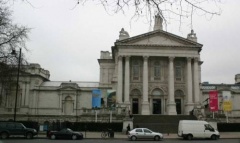
Tate Britain – stone wall ediface home to the cosied-up English art establishment..

Officially unveiled within the hallowed and pompous marble halls of Tate Britain today, the six winning
Olympic posters – a mini genre traditionally associated  with the run-up to the games. Focusing on two
of the works, now plastered on sundry walls over London and sold in limited edition print runs at
several hundred pounds sterling a piece…. ker-ching.

RBFT Dingo2Rachel-Whiteread-London-2012-375x500olympic rings

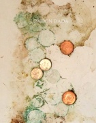
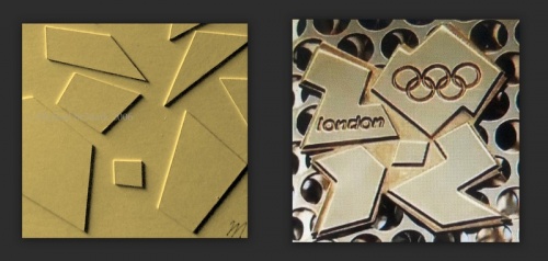
New Dada artist Dingo‘s October 10th work Bank of Formica Topboard (crop),  alongside Turner prize-winning artist Rachel Whiteread’s Olympic poster,  which she connects somewhat tenuously with future memories of medal-winning celebrations in mind, hence the multiple drinks glasses/bottles ring marks upon a white ( Formica?) surface. Hmm. 
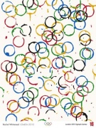
And, far right, the legendary Olympic rings brand, indicating the amount of novel thought involved in the poster’s creation.
At any rate, Whiteread’s rather drab effort still appears to be getting all the merits for “most original” of the 6 posters, that have
overall received something of a pasting from art critics.

Link to the gallery page
http://londondada.blog.co.uk/2011/10/10/london-dada-work-522-bank-of-formica-topboard-by-dingo-11993809/

Howard-Hodgkin-Swimming-375x500

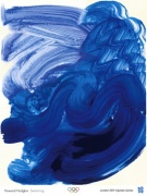
Another of Dingo’s creations, Nowt ( “New Dada blue period” ) from a year ago ( far left ) … and painter Howard Hodgkin’s winning Olympic   poster ” Swimming”. ( *nb. note the identical shades of blue that Hodgkin used, as well as ultra simplicity of the work ).

Linkback to the gallery page
http://londondada.blog.co.uk/2010/12/10/london-dada-work-417-nowt-10155419/

( Click on any of the images to enlarge )


M. St.M

London Bridge,
November 5th 2011.